Following my inner muse to write an epic science-fiction novel—the first in a trilogy, no less—encompasses a myriad of essential responsibilities beyond word-smithing to the nth degree to reach THE END.
In the ever-expanding world of self-publishing, it falls on the author’s shoulders to determine how to handle the journey from a raw manuscript to a polished final product. Should one outsource a lot, a little, or throw caution to the wind and go full-bore DIY. I surmise a majority of talented writers outsource the editing process to an eagle-eyed grammar hawk. (Notice how I flipped the bird?) They may also open their wallets to hire savvy social media experts and proficient web programmers to maintain and promote their author brand within the binary and omnipresent digital realm.
However, do they entrust the crucial aspect of a book’s typographical design and formatting to a seasoned pro, thereby ensuring a clean and consistent reading experience from the title page to the last word in print and ebook formats? Maybe. I believe many authors opt for a DIY approach from what I have seen, which is unfortunate. Trust me; this is no small feat and clamors for an experienced graphic design pro. Do not venture into the deep end of the pool and attempt to format a book’s interior pages yourself unless you know what you are doing. A poorly designed book will spoil the best narrative, while a well-designed book can elevate a mediocre story. It is unfair, but appearances matter a lot, leading to the most critical aspect of the book publishing process outside a clean manuscript—the book cover.
My Book Cover’s Creative Design Odyssey
Having delineated the fundamental aspects beyond writing that make a book successful, I admit to going full-bore DIY. Full disclosure: It’s my curse as a 25-year graphic design pro with way too much creativity and art direction under my belt to let another artist touch my baby. The horror! Believe me, there were moments where I considered it, but at the end of the day, I had a vision, and I was damned if I wasn’t going to see it through on my own. Come hell or high water.
While closing in on the climactic final chapters of The Golden Ellipse, still knee-deep in the editing process, I began sketching out cover ideas in earnest, starting with abstract designs leveraging the lynchpin golden ellipse and the proto-pyramid beacon as the featured graphical elements. There was nothing necessarily wrong with these cover designs, yet as colorful and eye-catching as they appeared, they placed too much emphasis on those iconic objects. The book’s title defines the solid gold relic serving as the story’s MacGuffin. [1] Yet, elaborate and busy concepts featuring spiraling Fibonacci-inspired [2] abstract designs left me cold. Similarly, cover designs featuring the pyramid fell flat. Although representative of an integral place within the narrative, the shape proved misleading as it looks like, well, a pyramid. Additional concepts portraying pyramids from forced perspectives ended up more confusing than eye-catching. Below are some of the outtakes from this part of the design process.

The ever-popular and over-used back-turned characters in peril visual trope. 
Fibonacci-inspired design featuring the golden ellipse. 
Abstract pyramid perspective concept. 
A graphic approach showing the beacon in its former glory. I like this but felt it told the wrong story. 
Another version of the ever-popular back-turned characters in peril idea. Still no.
During this arduous design process, I had a nagging idea in the back of my head to turn the cover art into more of a movie poster, ala Drew Struzan, [3] a personal favorite. You may not know his name, but I guarantee you have seen his phenomenal artwork adorning the walls inside your local multiplex. Remember those? I digress.
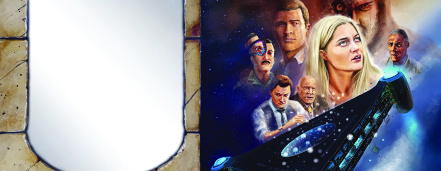
Nothing is as intriguing as adding the human element to a well-balanced and colorful book cover design. For both readers and writers, faces resolve in the mind’s eye, lending form and character to good guys, bad guys—and those lurking in the murky grays in between. On occasion, a descriptive passage describing a characters’ hair color or the subtle curvature of a lip stimulates the limitless reaches of the imagination. For myself, I spent time honing the look for each character in my novel, akin to the casting director of a Spielbergian blockbuster. From my lead actors, Rachel and Owen Haig, down to bit players like a Tunisian businessman or a corrupt robot technician, their time on the page, however short, manifested into fully realized actors with backstories extending beyond the page. I decided that to do justice to my 500+ page sci-fi novel, I needed to represent as many of these characters as possible in a single movie poster-like book cover illustration. And to make things more challenging, I wanted to match at least in style and tone, if not deft illustrative ability, the look and feel of a Drew Struzan epic movie poster. Oh yeah, I still had a book to finish, a website to build, and a host of other tasks screaming for my DIY attention. No problemo.
I’m not too fond of boring how-to’s, and an endless catalog of instructive books and videos are available to walk prospective portrait artists through the complicated and unforgiving task of drawing the human face. A favorite reference for me is Proko.com. [4] Artists spend lifetimes mastering the intricacies of a nose or the shape of an ear. Now multiply the complex task of producing a proportional representation of an individual by placing multiple actors’ visages into a collage design while balancing light sources to maintain a natural overall theatrical aesthetic.
Needing a non-human element to add the finishing touches to the design, I painted the space tourism ship from the opening chapter of The Golden Ellipse on the cover. This addition also serves as my subtle tribute to the Expanse novels that rekindled my love for all things science fiction. I have long admired the cover illustrations for S.A. Corey’s Expanse series. [5] While I am a quick google from the artist’s name, his powerful paintings of spaceships and planetary conflicts deliver the dramatic space opera tone for that fantastic book series.
The gallery below shows snapshots of my iterative process from one cover concept to the next revealing the sausage-making in all its glory: pulling, pushing, moving, resizing, wholesale changing, adding, and deleting until finally reaching the last concept worthy of gracing the cover of my science fiction novel. While I enjoy traditional techniques as much as the next artist, digital is far more practical and forgiving for this process. However, I wanted the digital painting to appear as traditional as an iconic Drew Struzan illustration airbrushed onto a high-quality artboard. To achieve this, I use a Mac-based 24-inch Wacom Cintiq Pro that allows for drawing directly onto the screen—a mind-blowing hi-def artistic experience that unlocks creative doors one might never open in traditional media, and well worth the hefty price tag. After preselecting my digital arsenal of pencil and watercolor brushes and a base color palette, I let loose the power of Photoshop over detailed drawings for each character’s final pose using photo references that I will keep to myself. Next, I collected each actor’s completed image into a master layered file, leaving space for the title, etc., adhering to the resolution and dimensions for my 6×9 inch trade paperback book. Sounds easy, right? This process, from start to finish, took over three months to complete. But it was worth it. The hardest part is deciding on the final brush stroke.

This was my initial pass on a character-driven composition. 
From there, the elements moved around and it began to take on a life of its own. 
Looking back I now see this as the kitchen sink approach. 
I also began painting limestone and granite textures into these compositions to add another visual element to the floating collage. The large pencil rough is a drawing of Pharaoh Khufu’s only known statue to exist. 
This was a screengrab near the end of the process when I was still pushing scenes from the book’s narrative, like the flashback world war 2 sequence.
Believe it or not, there is a method to my madness, and as I said at the beginning, so much more than writing goes into publishing a book. As an aside, I also developed the fully-validated epub 3 files using Adobe InDesign. I will elaborate on the ebook creation process in a later blog post.
Cheers!
And as always, we are looking for book reviews. Buy a print or ebook copy wherever books sell in this vast and mysterious universe. After reading the novel, pen a review. It’s fun, and you can say whatever you like—rambling on incoherently. Sort of like I am doing here.
References
- https://en.wikipedia.org/wiki/MacGuffin
- https://johnhopkinsauthor.com/what-is-the-golden-ellipse/
- https://en.wikipedia.org/wiki/Drew_Struzan
- https://www.proko.com
- https://en.wikipedia.org/wiki/The_Expanse_(novel_series)


